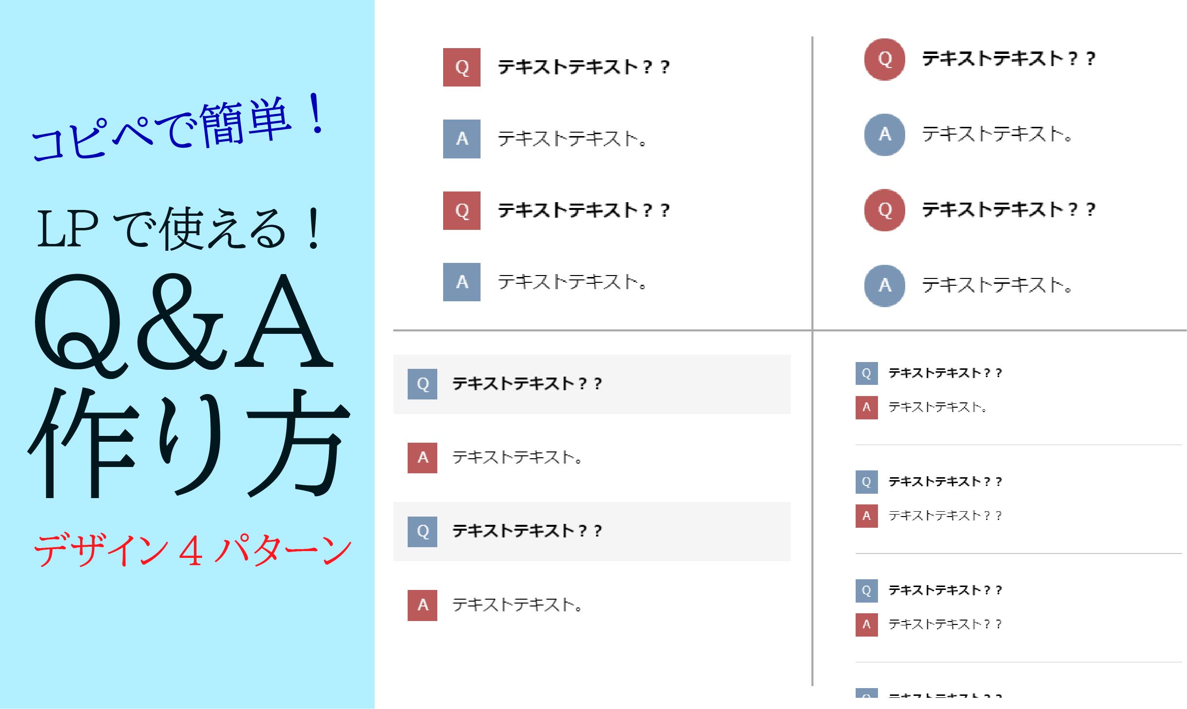
LPなどでよく見かける、Q&Aセクションの作り方です。
コピペしてお好みで色を変えるなど、ご自由にお使いください。
もちろんレスポンシブにも対応しています。
パターン1(四角アイコン)
シンプルなQ&A。
どんなサイトにも使いやすいデザインです。
完成形はこちら
See the Pen QA1 by yusuke-morioka (@yusuke-morioka) on CodePen.
コードはこちら
<body>

    <dl class="Qa-Box">
        <div class="Qa">
            <dt>
                <p>テキストテキスト??</p>
            </dt>
            <dd>
                <p>テキストテキスト。</p>
            </dd>
        </div>
        <div class="Qa">
            <dt>
                <p>テキストテキスト??</p>
            </dt>
            <dd>
                <p>テキストテキスト。</p>
            </dd>
        </div>
    </dl>

</body>
.Qa-Box {
width: 80%;
margin: 0 auto;
}
.Qa-Box .Qa dt,
.Qa-Box .Qa dd {
display: flex;
align-items: baseline;
margin: 30px 0;
}
.Qa-Box .Qa dt p {
margin: 0;
padding-left: 15px;
font-weight: bold;
width: 100%;
}
.Qa-Box .Qa dd p {
margin: 0;
padding-left: 15px;
width: 100%;
}
.Qa-Box .Qa dt::before {
content: "Q";
display: flex;
justify-content: center;
align-items: center;
background: #D65556;
color: #fff;
width: 35px;
height: 35px;
}
.Qa-Box .Qa dd::before {
content: "A";
display: flex;
justify-content: center;
align-items: center;
background: #6699B7;
color: #fff;
width: 35px;
height: 35px;
}
@media screen and (max-width: 960px) {
.Qa-Box {
width: 95%;
}
}パターン2(丸アイコン)
QとAのアイコンが丸くなっているデザインパターンです。
パターン1に「border-radius」を追加し、若干サイズを変えただけです。
完成形はこちら
See the Pen QA2 by yusuke-morioka (@yusuke-morioka) on CodePen.
※↑アイコンが縦長の小判型の形に見えることもあるかもしれません。
しかしこれはCodePenサンプルの表示の関係です。
全画面で見ればちゃんと丸なのでご安心ください。
コードはこちら
<body>

    <dl class="Qa-Box">
        <div class="Qa">
            <dt>
                <p>テキストテキスト??</p>
            </dt>
            <dd>
                <p>テキストテキスト。</p>
            </dd>
        </div>
        <div class="Qa">
            <dt>
                <p>テキストテキスト??</p>
            </dt>
            <dd>
                <p>テキストテキスト。</p>
            </dd>
        </div>
    </dl>

</body>
.Qa-Box {
width: 80%;
margin: 0 auto;
}
.Qa-Box .Qa dt,
.Qa-Box .Qa dd {
display: flex;
align-items: baseline;
margin: 30px 0;
}
.Qa-Box .Qa dt p {
margin: 0;
padding-left: 15px;
font-weight: bold;
width: 100%;
}
.Qa-Box .Qa dd p {
margin: 0;
padding-left: 15px;
width: 100%;
}
.Qa-Box .Qa dt::before {
content: "Q";
display: flex;
justify-content: center;
align-items: center;
background: #D65556;
color: #fff;
width: 38px;
height: 38px;
border-radius: 50px;
}
.Qa-Box .Qa dd::before {
content: "A";
display: flex;
justify-content: center;
align-items: center;
background: #6699B7;
color: #fff;
width: 38px;
height: 38px;
border-radius: 50px;
}
@media screen and (max-width: 960px) {
.Qa-Box {
width: 95%;
}
}パターン3(網掛けデザイン)
Qの部分が、薄いグレーであみかけされているパターンです。
完成形はこちら
See the Pen QA3 by yusuke-morioka (@yusuke-morioka) on CodePen.
コードはこちら
<body>

    <dl class="Qa-Box">
        <div class="Qa">
            <dt>
                <p>テキストテキスト??</p>
            </dt>
            <dd>
                <p>テキストテキスト。</p>
            </dd>
        </div>
        <div class="Qa">
            <dt>
                <p>テキストテキスト??</p>
            </dt>
            <dd>
                <p>テキストテキスト。</p>
            </dd>
        </div>
    </dl>

</body>
.Qa-Box {
width: 80%;
margin: 0 auto;
}
.Qa-Box .Qa dt,
.Qa-Box .Qa dd {
display: flex;
align-items: baseline;
margin: 15px 0;
padding: 15px;
}
.Qa-Box .Qa dt {
background: #F5F5F5;
}
.Qa-Box .Qa dt p {
margin: 0;
padding-left: 15px;
font-weight: bold;
width: 100%;
}
.Qa-Box .Qa dd p {
margin: 0;
padding-left: 15px;
width: 100%;
}
.Qa-Box .Qa dt::before {
content: "Q";
display: flex;
justify-content: center;
align-items: center;
color: #fff;
background: #6699B7;
width: 2em;
height: 2em;
}
.Qa-Box .Qa dd::before {
content: "A";
display: flex;
justify-content: center;
align-items: center;
color: #fff;
background: #D65556;
width: 2em;
height: 2em;
}
@media screen and (max-width: 960px) {
.Qa-Box {
width: 95%;
}
}パターン4(区切り線つき)
一つの質問ごとに、線で区切られているパターンです。
完成形はこちら
See the Pen QA4 by yusuke-morioka (@yusuke-morioka) on CodePen.
コードはこちら
<body>

    <dl class="Qa-Box">
        <div class="Qa">
            <dt>
                <p>テキストテキスト??</p>
            </dt>
            <dd>
                <p>テキストテキスト。</p>
            </dd>
        </div>
        <div class="Qa">
            <dt>
                <p>テキストテキスト??</p>
            </dt>
            <dd>
                <p>テキストテキスト??</p>
            </dd>
        </div>
        <div class="Qa">
            <dt>
                <p>テキストテキスト??</p>
            </dt>
            <dd>
                <p>テキストテキスト??</p>
            </dd>
        </div>
        <div class="Qa">
            <dt>
                <p>テキストテキスト??</p>
            </dt>
            <dd>
                <p>テキストテキスト??</p>
            </dd>
        </div>
    </dl>

</body>
.Qa-Box {
width: 80%;
margin: 0 auto;
}
.Qa-Box .Qa {
padding: 20px 0;
border-bottom: 1px solid #c8c8c8;
}
.Qa-Box .Qa dt,
.Qa-Box .Qa dd {
display: flex;
align-items: baseline;
margin: 15px 0;
}
.Qa-Box .Qa dt p {
margin: 0;
padding-left: 15px;
font-weight: bold;
width: 100%;
}
.Qa-Box .Qa dd p {
margin: 0;
padding-left: 15px;
width: 100%;
}
.Qa-Box .Qa:last-of-type {
border-bottom: none;
}
.Qa-Box .Qa dt::before {
content: "Q";
display: flex;
justify-content: center;
align-items: center;
color: #fff;
background: #6699b7;
width: 2em;
height: 2em;
}
.Qa-Box .Qa dd::before {
content: "A";
display: flex;
justify-content: center;
align-items: center;
color: #fff;
background: #d65556;
width: 2em;
height: 2em;
}
@media screen and (max-width: 960px) {
.Qa-Box {
width: 95%;
}
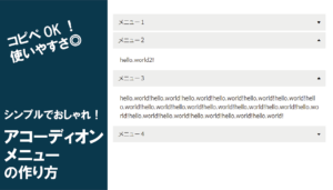
}パターン5(アコーディオン)
クリックで初めて回答が現れる、アコーディオン形式のQ&Aです。
完成形はこちら
See the Pen QA5 by yusuke morioka (@yusuke-morioka-the-scripter) on CodePen.
コードはこちら
<dl class="faq-accordion">

  <details class="faq-item">
    <summary class="faq-question">
      <span class="question-text">質問テキスト??</span>
      <span class="toggle-icon"></span>
    </summary>
    <div class="faq-answer">
      <p>回答テキスト。</p>
    </div>
  </details>

  <details class="faq-item">
    <summary class="faq-question">
      <span class="question-text">質問テキスト??</span>
      <span class="toggle-icon"></span>
    </summary>
    <div class="faq-answer">
      <p>回答テキスト。</p>
    </div>
  </details>

</dl>
/* ===== FAQ アコーディオン ===== */
.faq-accordion {
width: 80%;
margin: 0 auto;
}
.faq-accordion .faq-item {
border-bottom: 1px solid #e0e0e0;
}
.faq-accordion .faq-item:last-child {
border-bottom: none;
}
/* --- 質問部分 --- */
.faq-accordion .faq-question {
list-style: none;
display: flex;
align-items: center;
padding: 20px 0;
cursor: pointer;
user-select: none;
}
.faq-accordion .faq-question::-webkit-details-marker {
display: none;
}
.faq-accordion .faq-question::before {
content: "Q";
display: flex;
justify-content: center;
align-items: center;
flex-shrink: 0;
background: #D65556;
color: #fff;
width: 36px;
height: 36px;
border-radius: 50%;
font-weight: 700;
font-size: 0.9rem;
margin-right: 16px;
}
.faq-accordion .faq-question .question-text {
flex: 1;
font-weight: 600;
font-size: 0.95rem;
}
/* --- 開閉アイコン(+ / −) --- */
.faq-accordion .faq-question .toggle-icon {
position: relative;
flex-shrink: 0;
width: 20px;
height: 20px;
margin-left: 16px;
}
.faq-accordion .faq-question .toggle-icon::before,
.faq-accordion .faq-question .toggle-icon::after {
content: '';
position: absolute;
background: #999;
transition: transform 0.3s ease;
}
/* 横棒 */
.faq-accordion .faq-question .toggle-icon::before {
top: 50%;
left: 0;
width: 100%;
height: 2px;
transform: translateY(-50%);
}
/* 縦棒(開くと回転して−になる) */
.faq-accordion .faq-question .toggle-icon::after {
top: 0;
left: 50%;
width: 2px;
height: 100%;
transform: translateX(-50%) rotate(0deg);
}
.faq-accordion details[open] .faq-question .toggle-icon::after {
transform: translateX(-50%) rotate(90deg);
}
/* --- 回答部分 --- */
.faq-accordion .faq-answer {
display: flex;
align-items: baseline;
padding: 0 0 24px 0;
animation: fadeIn 0.3s ease;
}
.faq-accordion .faq-answer::before {
content: "A";
display: flex;
justify-content: center;
align-items: center;
flex-shrink: 0;
background: #6699B7;
color: #fff;
width: 36px;
height: 36px;
border-radius: 50%;
font-weight: 700;
font-size: 0.9rem;
margin-right: 16px;
}
.faq-accordion .faq-answer p {
flex: 1;
font-size: 0.92rem;
line-height: 1.8;
color: #555;
}
@keyframes fadeIn {
from { opacity: 0; transform: translateY(-8px); }
to { opacity: 1; transform: translateY(0); }
}
/* --- レスポンシブ --- */
@media screen and (max-width: 960px) {
.faq-accordion {
width: 95%;
}
}まとめ
以上、LPで使えるQ&Aデザインを紹介しました。Q&Aセクションはユーザーの不安を解消する大事なパートなので、デザインにもこだわりたいところです。
ちなみに、作ったLPをサクッと公開したいなら、レンタルサーバーがあると便利です。以下に記載のレンタルサーバーは、WordPressも簡単にインストールでき、LP制作から公開まで一気通貫でできます。
エックスサーバー:国内人気No1。高スペックで通信速度・安定感ともに定評。

ConoHa WING:WordPress簡単セットアップに対応。通信速度と金額のバランス◎。
ロリポップ:WordPressと好相性で表示速度は業界最速。価格も優しく個人利用には十分。
これから初めてサーバーを触る方は、エックスサーバーがおすすめです。
ちなみに本サイトもエックスサーバーなのですが、とにかくセットアップや設定がラクで、通信速度やつながりやすさについても、いまだに不便を感じたことは一度もありません。
1992年生まれ|2020年10月フリーランスとして独立|Web制作、SEOライティングを軸に活動中|接客→生産管理→システム開発会社→現在|モリブログ運営。Web制作、フリーランスジャンルを中心に更新中。PV数は年間14万人以上||温泉、旅行、甘いものが好き。